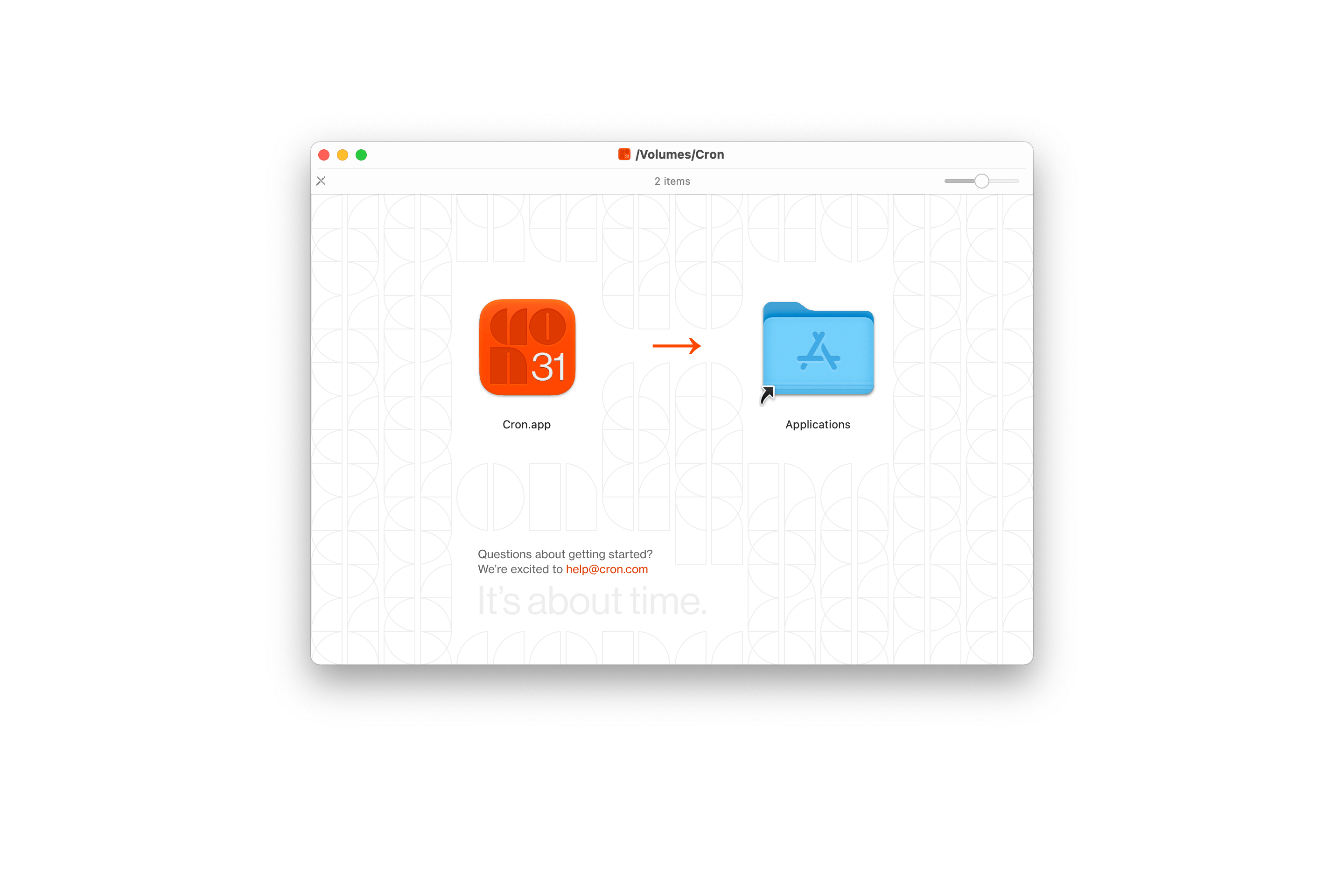
New installer
The latest version of Cron comes with a new installer that reflects Cron’s grid-based brand. In addition, you’ll find this visual language applied in other corners of the app and our web presence.
Next-level grid UX
We’ve taken grid-level interactions to a whole new level. Moving items on the grid is as fluid as in no other calendar app. The interaction is delightful and precise. You can select multiple items and drag and drop them.
When navigating to another date, we highlight the day with an orange flash. For example, this happens when clicking in the left-hand mini month navigator or when using the ⌘ K > Go to… command. It’s both delightful and helps you quickly orient yourself.
Furthermore, grid items got a highlight hover state, and Cron more accurately matches colors from Google Calendar.
Other improvements
- Adds
⌘Kcommand “Change color of selected event” for selected event(s). - Enables buttons “Go to next/previous event” right away during creation of a series.
- Changes button text in pending changes dialog from “Continue editing” to “Cancel” when deleting an event.
- Hides “Pick an available time on your calendar” once a time is picked.
- Fixes auto-linking of URLs.