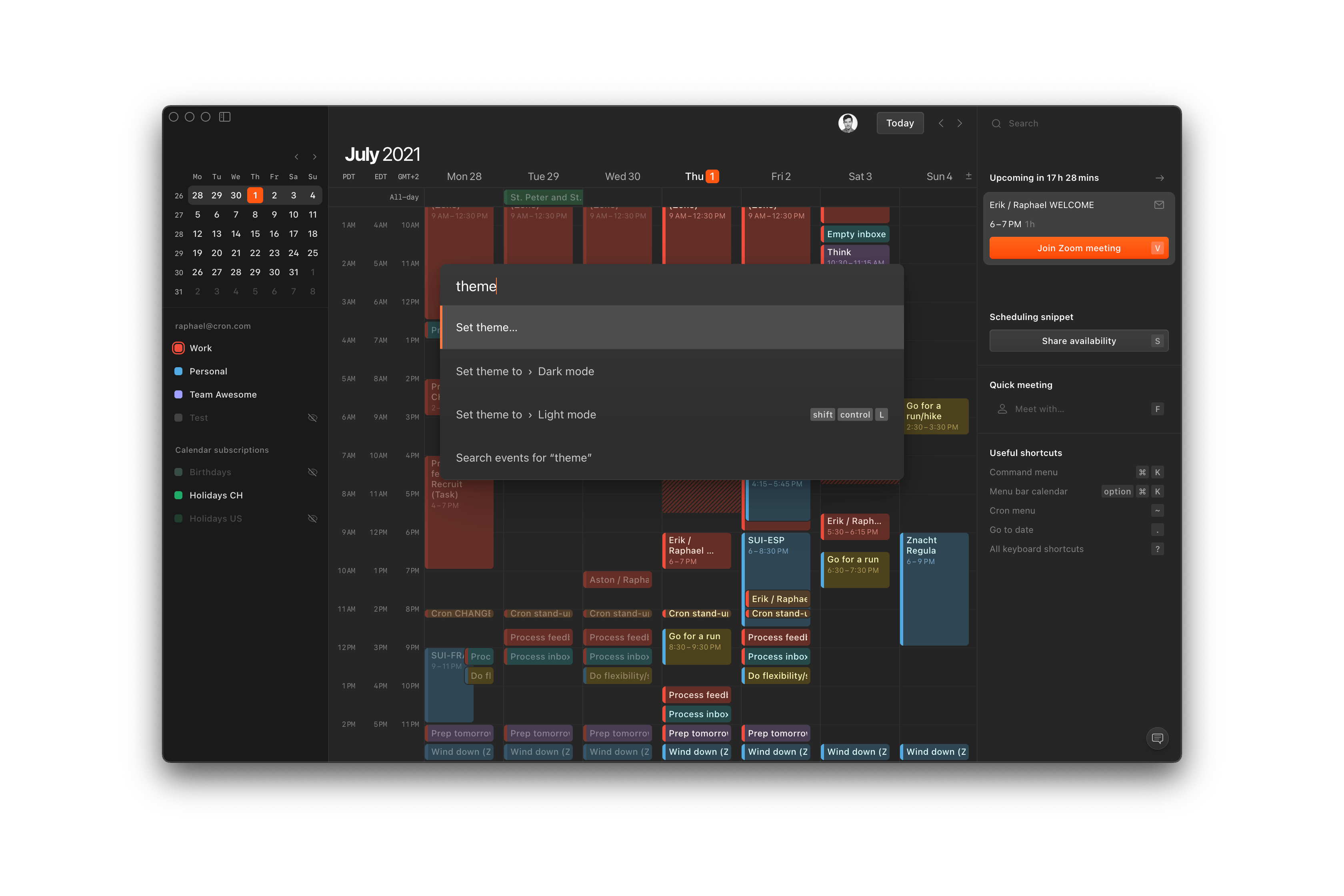
Dark mode
Cron dark mode is here — and it looks hot. Light or dark, the intentionally neutral interface makes the calendar content and fiery orange accents really pop.
Set Cron to your preference in Settings > General > Theme:
- Auto — automatically follows your system appearance. This is the default.
- Light mode — now with bolder colors and higher contrast between past and future events.
- Dark mode — the gorgeous new dark mode, complementing our light mode.
You can also set it via ⌘ K > Set theme… or even quick-toggle the theme between light and dark with shift control L.
To achieve a uniform look and stay true to all possible calendar colors, we use the CIECAM02 color space and apply a set of transforms. We iterated on both modes because custom colors, viewing conditions, and personal preferences vary greatly. Let us know what you think, and we continue polishing it.
Desktop app improvements
Multiple improvements to the Cron macOS desktop app are culminating right now. The initial launch time is faster, a few issues with the native fullscreen mode are resolved, and dragging the Cron window is extended to headers of in-app modal views like the settings and feedback views.
Lastly, we’ve removed the “Switch to Cron Classic” option — big thanks to all the early users at this point.
Other improvements
- Improves suggestions for time inputs that include an explicit “am”/“pm”.
- Fixes exact times in “to” time field being interpreted as durations.
- Fixes
tabbing from “start” time field focusing the wrong field in specific scenarios. - Fixes
escnot defocusing radio controls. - Fixes holds disappearing in specific scenarios while sharing an availability.