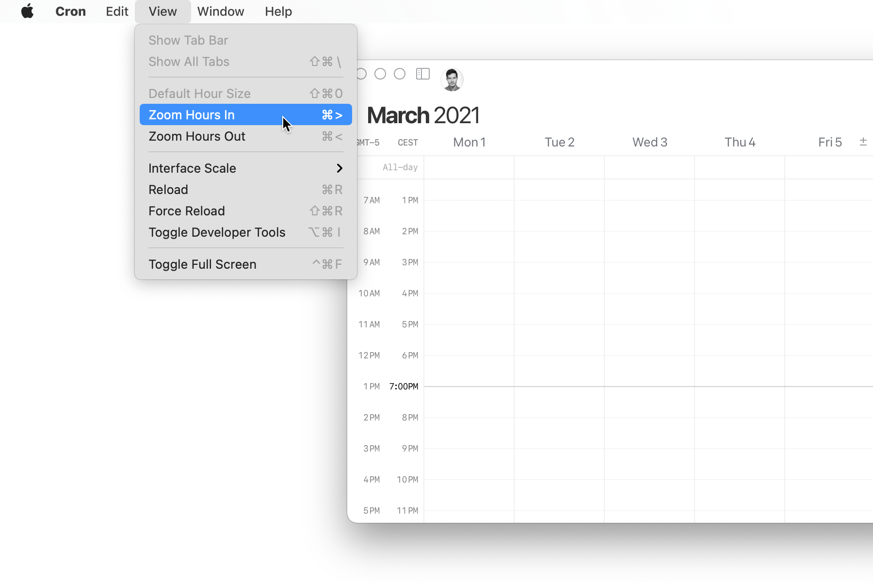
Grid density and resizing
We have drastically improved the vertical layout of the grid and added user controls to fine-tune it.
By default, the vertical density of the grid should always feel “just right”. If you resize Cron’s window to taller than 24 hours, we start increasing the row height but smartly keep you anchored in place. If you’re on a smaller screen and want that high-level overview, so you never have to scroll, we give you some controls to manually make the view more compact (or the opposite).
- See fewer hours for a more comfortable view: View > Zoom Hours In (also
shift⌘.) - See more hours for a compact view: View > Zoom Hours Out (also
shift⌘,) - Reset to default grid density: View > Default Hour Size (also
shift⌘0)
You’ll also find commands for these in the ⌘ K command menu.
Other improvements
- Fine-tunes interaction when dragging short event chips (e.g., 15 mins).
- Combines start and end time into a single “Time” row in an event’s pending changes changelog.
- Improves dialogs when deleting a repeat event.
- Improves auto-saving behavior when backgrounding or closing Cron window quickly after making changes.
- Improves participants suggestions.
- Improves layout of inline quick-copy buttons.
- Changes keyboard shortcut for “Join meeting” button to
V(previouslyM). - Fixes remove participant button showing in pending changes dialog.
- Fixes “Go back to today” button in the left-hand mini month navigator.
- Fixes cursor position when clicking into margins of text input field.